One of the biggest advantages of digital signage is flexibility. Unlike a printed sign that remains unchanged until it is physically replaced, a digital display can show product photography, promotions, announcements, animated graphics, video, live information and multiple messages throughout the day.
That flexibility creates another question for businesses:
What should you actually put on the screen?
It is easy to assume that because an LED display can play full-motion video, video must automatically be the most effective option. In reality, the best-performing content is usually determined by something much more important than the technical capabilities of the screen: how people encounter it.
A customer walking slowly through a shopping centre has a very different opportunity to engage with a display from a motorist passing a roadside LED sign. Someone waiting five minutes in a reception area can absorb considerably more information than somebody driving past a business at 60 kilometres per hour. A person standing in a café queue may watch a short product video, while a commuter approaching a dealership may only have enough time to recognise the brand, understand one offer and decide whether to turn into the driveway.
That is why static images, animation and video all have a place in effective digital signage. The question is not which format is universally better. The question is which format communicates the message most effectively in the time and environment available.
Research into real-world digital displays illustrates this distinction. One field study involving 1,294 customers in a clothing boutique found that dynamic content attracted longer average attention than static content — 0.9 seconds compared with 0.6 seconds. However, average attention to the display remained very short overall. The study is useful as evidence that movement can help attract the eye, but it also demonstrates why capturing attention is only the beginning: the audience still needs to understand the message during a limited viewing opportunity.
At Blink Digital, we help Australian businesses choose, design, install and manage digital signage for environments ranging from retail and automotive premises to schools, events, outdoor advertising and commercial locations. Our approach is therefore not simply about making a screen look impressive. It is about matching the screen, location and content to the people who need to see it. Blink Digital provides custom LED screens, installation, consulting, design, programming, maintenance and ongoing support, with projects across Brisbane, the Sunshine Coast, the Gold Coast and other parts of Australia.
So, when should you use static creative? When does subtle animation improve performance? When is full video the right choice? And when can too much movement actually make your digital signage less effective?
Let us look at the decision from the audience’s point of view.
The Most Important Digital Signage Question: How Long Does the Audience Have?
Before deciding between a photograph, animated graphic or video, determine the audience’s realistic viewing opportunity.
This matters because people rarely stand in front of commercial digital signage waiting patiently for every message in the playlist.
They are doing something else.
They might be walking to a shop, driving to work, looking for parking, waiting for an appointment, choosing lunch, browsing a showroom, finding a classroom or entering an event.
Your screen is competing with that primary task.
This means the best content strategy begins with three questions.
First, how far away is the viewer?
Second, how quickly are they moving?
Third, how long are they realistically likely to look at the screen?
A large roadside LED display may be visible from a considerable distance, but that does not mean motorists will carefully read it for 20 seconds. Conversely, a smaller indoor display beside a waiting area may have a much longer viewing opportunity even though the physical viewing distance is short.
The distinction between being able to see a screen and actually paying attention to it is important. Audience-measurement research specifically separates measures such as time in view, dwell time and actual attention time because they are not the same thing.
For businesses planning digital signage with Blink Digital, this is one reason we consider screen placement, viewing distance, audience behaviour and the surrounding environment alongside the hardware itself. A brilliant screen in the wrong position — or displaying content designed for the wrong viewing behaviour — cannot reach its full potential.
When Static Images Work Best on Digital Signage
Static content can sometimes seem like the least sophisticated use of a digital display.
It should not.
A well-designed static frame is often one of the most effective formats available.
Static content is particularly powerful when the audience has limited time to process information. Instead of requiring the viewer to follow movement or wait for the next stage of an animation, the complete message appears immediately.
Imagine a driver approaching a retail centre and seeing:
WEEKEND SALE
30% OFF
TURN LEFT
The customer does not need to wait for the headline to animate onto the screen. They do not need to watch a product video to understand what is being advertised. The complete proposition can be recognised in a glance.
This makes static creative particularly suitable for roadside displays, business identification, directional messaging, price-led promotions, opening hours, simple announcements and other situations where speed of comprehension matters more than entertainment.
Static does not mean boring.
Strong photography, bold typography, large numbers, high contrast, distinctive brand colours and clean composition can make a static screen extremely noticeable.
In fact, one advantage of an LED screen is that businesses can rotate multiple static creatives throughout the day. The individual advertisement remains motionless while displayed, but the overall signage strategy remains flexible because the message can change according to time, campaign, audience or business priorities.
A retailer could promote breakfast products in the morning, a lunchtime offer around midday and a weekend promotion later in the afternoon without requiring continuous animation.
A school could move between upcoming events, important dates and community announcements.
A dealership could rotate featured models, servicing offers and test-drive messages.
A hospitality venue could promote lunch, dinner, upcoming entertainment and accommodation availability at different times.
Blink Digital can help businesses create this type of scheduled signage strategy, ensuring that content remains dynamic at a campaign level without necessarily requiring constant movement within every individual frame.
Static content is especially strong at speed
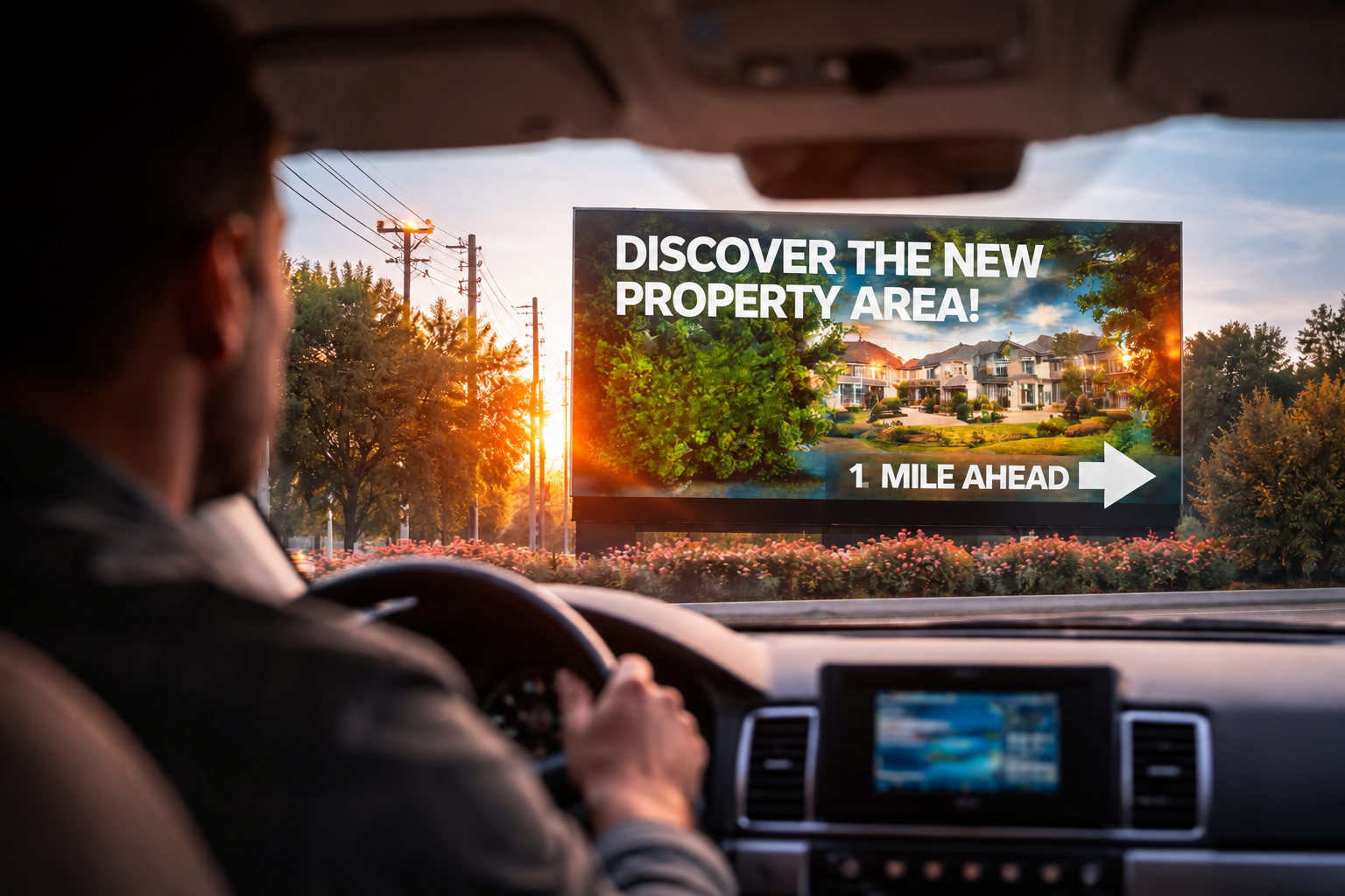
The case for simple static messaging becomes even stronger when the screen is visible to drivers.
Brisbane City Council’s technical standards for illuminated and electronic advertising explicitly recognise road speed, automatically changing content, message rotation and dwell time as factors that can affect driver attention.
Australian research funded by Main Roads Western Australia also examined digital billboard complexity and dwell time. In a driving simulator study involving 96 participants, simpler billboard content and longer dwell times produced less negative effects on driving outcomes than complex content and shorter display periods.
The marketing lesson is important even before considering regulatory requirements:
when people have less time, simplify.
For roadside digital signage, giving the audience one strong message can often be more effective than demonstrating everything the display is capable of doing.
When Subtle Animation Works Best
If static creative offers immediate comprehension and full video offers rich storytelling, subtle animation sits somewhere between the two.
For many commercial digital signage applications, that middle ground can be extremely effective.
Animation can create the visual change needed to attract attention without requiring the viewer to follow a complete video narrative.
For example, instead of animating every object on the screen, a retailer might keep the main product image and headline stationary while gently introducing the price.
A dealership might display a stationary vehicle image while a promotional badge appears.
A café might keep its breakfast offer visible while steam moves subtly above a coffee.
An event display might introduce a headline with a short transition and then allow the complete message to remain still.
This approach uses movement as a signal rather than making movement the entire experience.
That distinction matters.
The field study mentioned earlier found higher attention time for dynamic digital-signage content than static material, suggesting that movement can increase the likelihood of attracting a viewer’s gaze.
But attracting an eye and communicating a message are different objectives.
Animation should therefore help the audience discover the important information rather than compete with it.
Motion should have a job
A useful way to evaluate animation is to ask:
What is this movement helping the viewer understand?
If the answer is unclear, the animation may not be necessary.
Good animation can establish hierarchy. It can bring attention to a price, offer, product, date or call to action.
Poor animation often moves elements simply because the software allows them to move.
Text flies in from four directions. The logo spins. Background particles move. The photograph zooms. A glowing border flashes. Three offers rotate at the same time.
Technically, it may demonstrate what an LED screen can do.
Commercially, however, the customer may leave remembering none of it.
At Blink Digital, we can help businesses design LED content around a clear communication hierarchy. The goal is not to make every pixel active. The goal is to make the right information noticeable.
When Full Video Works Best on Digital Signage
Video becomes much more powerful when the audience has enough time to watch it.
This makes it particularly suitable for environments such as reception areas, waiting rooms, event venues, hospitality interiors, showrooms, retail browsing areas, exhibition stands and other locations with meaningful dwell time.
A motorist does not have time to watch a 15-second explanation of a new product.
Someone waiting three minutes at a service counter may.
This difference transforms what is possible.
Full video allows digital signage to demonstrate products, communicate atmosphere, explain processes, showcase testimonials, introduce staff, show facilities, promote destinations or build an emotional connection with an audience.
A dealership could show a vehicle moving through different environments.
A hotel could showcase accommodation, restaurants, facilities and experiences.
A gym could display exercise demonstrations.
A retailer could show products being worn or used rather than simply photographed.
An entertainment venue could use trailers, event highlights and artist footage.
A school or sporting organisation could show event highlights, achievements or community content.
Blink Digital already provides LED signage for entertainment and events where video and motion graphics can play a natural role in creating atmosphere and audience engagement.
The key phrase, however, is where video is appropriate.
The fact that your digital signage can reproduce video does not mean every location should operate like a television.
Why Full-Motion Video Is Not Automatically More Effective
Movement attracts attention.
That statement can easily be misunderstood as:
More movement attracts more attention, therefore more movement is always better.
It is not that simple.
There are at least three problems with excessive motion.
The first is cognitive competition.
If several elements are moving at once, the viewer must decide where to look. The headline may be competing with a moving background, animated price, rotating logo and video footage.
The second is message dependency.
A static frame delivers the full message immediately. Video often distributes information over time.
Imagine the following 12-second sequence.
Seconds 0–3 establish the product.
Seconds 4–7 introduce the offer.
Seconds 8–10 explain the condition.
Seconds 11–12 reveal the call to action.
That might work perfectly for somebody standing in a queue for two minutes.
It is almost useless for somebody who looks at the display only during seconds 4–6.
The third problem is environmental appropriateness.
Research into roadside digital billboards consistently finds that animated or rapidly changing content places additional demands on driver attention. A 2021 simulator study comparing static, transitioning and animated digital billboard advertisements found that animated and transitioning designs drew more attention away from the road and affected driving performance more than static advertisements.
Brisbane City Council similarly treats electronic display content, dwell time, location and road-speed environment as traffic-safety considerations.
For businesses using roadside digital signage in Brisbane, this means content strategy must consider both communication effectiveness and applicable Council or road-authority requirements.
Blink Digital can assist clients with the signage-planning process, but businesses should never assume that because a display technically supports animation or video, every type of moving content will be appropriate for every location.
Viewing Distance Changes the Type of Content That Works
Consider two identical 2-metre-wide screens.
One is mounted inside a showroom and usually viewed from five metres away.
The second faces a road and is first visible much further away.
They may use the same hardware technology, but they should not necessarily display the same creative.
As viewing distance increases, fine detail becomes less useful.
Small text disappears.
Complex product photography becomes harder to interpret.
Secondary messages become less noticeable.
Multiple calls to action begin competing with each other.
The content must therefore become simpler as the audience moves further away.
Blink Digital considers viewing distance when recommending LED displays and screen specifications. The company’s custom-signage guidance similarly notes that shopfront viewers may be only a few metres from a display while signs viewed across streets or car parks require larger, simpler elements.
The same principle should guide the creative.
Close viewing allows detail
If the audience stands close to an indoor display, you can potentially use:
product features, supporting text, QR codes, multiple prices, menus, comparison information and more detailed video.
Medium-distance viewing requires hierarchy
For a shopfront, reception entrance, forecourt or pedestrian area, the screen normally needs a strong headline first, followed by supporting information that can be understood quickly.
Long-distance viewing requires reduction
For high-visibility outdoor LED signage, the question becomes:
What is the one thing we need people to recognise?
A brand.
A price.
A promotion.
An event.
An entrance.
An available service.
A date.
If a customer must decode six equally important pieces of information before understanding the advertisement, the design is probably too complicated.
Dwell Time Should Determine Content Depth
Viewing distance tells you what people can physically see.
Dwell time tells you how much they can realistically consume.
Consider four environments.
A vehicle may have seconds.
A pedestrian may have several seconds.
A customer browsing a showroom may have minutes.
A patient in a waiting area may have considerably longer.
Trying to use the same content strategy across those four environments is one of the most common mistakes in digital signage.
Very short dwell time: communicate, do not narrate
For motorists and fast-moving foot traffic, prioritise instant understanding.
Static content or extremely restrained animation generally makes the most sense.
The viewer should not need to see the beginning of a sequence to understand its ending.
Short-to-medium dwell time: attraction plus comprehension
Retail windows, forecourts, shopping precincts and entrances often suit subtle animation.
There is enough time for one visual change to attract attention, but not necessarily enough time for a long story.
Medium dwell time: sequencing becomes possible
In a queue, lobby, café, dealership showroom or waiting area, a playlist can begin to tell a story.
A customer may see several frames.
This is where animation, multiple-message campaigns and short video become much more useful.
Long dwell time: video can deliver depth
Where customers are expected to remain in the area, digital signage can become a richer communication channel.
You can explain services, demonstrate products, alternate commercial and informational content, provide entertainment and build brand familiarity.
This is why Blink Digital does not treat content as separate from screen placement. If we understand where the screen will sit and how the audience will behave around it, we can help determine what kind of creative is likely to suit the real viewing opportunity.
How Traffic Speed Should Change Your Digital Signage Content
Traffic speed deserves particular attention because roadside signage combines marketing with road-safety considerations.
The faster the audience travels, the shorter the effective communication window becomes.
That affects virtually every creative decision.
Words need to become fewer and larger.
Images need to become simpler.
Animations need to become less important.
Calls to action need to become easier to remember.
Message sequencing becomes more problematic because drivers cannot be expected to remain within the viewing area long enough to see an entire loop.
Research also supports taking a conservative approach. The Main Roads WA-funded study discussed earlier found that simple content and longer dwell periods were less problematic for driving performance than complex creative and frequent changes.
Official Australian guidance similarly emphasises short-glance readability. NSW’s transport-corridor signage guidelines state that information on roadside advertising should be kept to a minimum and no more than a driver can read in a short glance. The same guidelines impose strict requirements around static display periods for relevant digital signs and prohibit animated or video-style messages in the road environments covered by those rules.
Those particular NSW requirements should not be treated as Brisbane legislation, but the underlying principle is highly relevant: the road is not the place for complicated storytelling.
For Brisbane businesses, Brisbane City Council has its own advertising-device framework and specifically considers the road-speed environment and characteristics of changing electronic content when evaluating safety.
This is an area where Blink Digital can help businesses think through their proposed installation before content production begins, rather than creating elaborate animation first and only later discovering that the location requires a different approach.
How Many Words Should a Digital Sign Have?
There is no universal number of words that is correct for every digital sign.
Rules such as “always use seven words” or “people have exactly three seconds” can sound convenient, but they ignore differences in screen size, viewing distance, audience behaviour and environment.
A better principle is:
Use the fewest words needed to communicate the message clearly within the available viewing time.
For a fast roadside audience, that may mean:
END OF FINANCIAL YEAR SALE
UP TO 30% OFF
For a pedestrian shopfront, you may be able to add:
ENDS SUNDAY
For an indoor retail screen where customers are browsing, you might add exclusions, product categories or a QR code.
The important point is that every additional word creates another task for the viewer.
Before adding another line, ask whether it improves the decision you want the customer to make.
If it does not, remove it.
This is particularly important on LED displays because businesses sometimes feel compelled to “fill the screen”. Empty space may look wasted when designing on a computer monitor, but on a large commercial display it can provide the visual separation that makes the important information easier to understand.
Build a Clear Visual Hierarchy
Effective digital signage content should tell the eye where to look first, second and third.
A useful hierarchy is usually:
primary message → supporting information → action
For example:
NEW SUVs ARRIVED
Available This Weekend
Visit Our Showroom
Everything else is secondary.
Animation can reinforce this hierarchy by introducing the offer or action.
Video can reinforce it by visually demonstrating the product.
Static creative can reinforce it through typography, colour and scale.
Problems arise when every element demands first priority.
A huge logo.
A huge price.
A huge headline.
A large photograph.
A flashing call to action.
A second promotional badge.
A website address.
A phone number.
Social-media handles.
Fine print.
All of them may be useful individually, but together they can weaken the advertisement.
At Blink Digital, our graphic design and LED programming capabilities allow us to help businesses develop screen content that works within the characteristics of the display rather than simply transferring a print advertisement onto a digital screen. Blink Digital’s team includes graphic-design and LED-sign programming capability alongside installation, electrical, fabrication and project-management expertise.
Calls to Action: Ask the Audience to Do Something Realistic
Every commercial digital-signage message should have a purpose.
However, the right call to action depends heavily on where the audience is.
A driver should not be encouraged to complete a complicated digital action while moving.
A pedestrian may be able to scan a QR code.
Someone in a waiting area may be able to visit a website.
Someone standing inside a shop can be directed to a counter, product aisle or staff member.
A dealership audience might be encouraged to:
Turn In Today
A retail customer might see:
Shop Inside
A restaurant customer:
Order at the Counter
A reception screen:
Scan to Book
An event display:
Tickets Available Here
Digital signage becomes stronger when the desired next step fits naturally into what the viewer is already doing.
A common mistake is trying to include several calls to action simultaneously:
Call us.
Visit the website.
Scan the QR code.
Follow us.
Ask staff.
Book now.
When all of them appear together, none receives clear priority.
Choose the action most likely to happen in that environment.
Message Sequencing: Do Not Make Customers Wait for the Important Part
Multiple screens or slides allow a business to communicate more information.
They also create a major risk.
What happens if the customer sees only one slide?
Imagine a three-slide sequence:
Slide 1: Looking for a better deal?
Slide 2: We have something special this weekend.
Slide 3: 25% off selected products.
If a motorist sees only Slide 1, the advertisement communicates almost nothing.
This type of narrative can work where people have enough dwell time to see the sequence, but it is risky for transient audiences.
For short viewing opportunities, every major frame should work independently.
Instead of:
Slide 1: Ready for something new?
Slide 2: This weekend only…
Slide 3: 25% off outdoor furniture.
Use:
Slide 1: Outdoor Furniture — 25% Off This Weekend
Slide 2: Outdoor Furniture — Sale Ends Sunday
Slide 3: 25% Off — Visit Us Today
The campaign remains varied, but the offer survives if somebody sees only one frame.
This is particularly important for roadside digital signage and shopfront LED signs.
For long-dwell environments, sequencing can become much richer. A showroom customer might see a product introduction, feature demonstration, finance message and call to action across several connected screens.
The difference is not the technology.
It is the viewing behaviour.
Static vs Animation vs Video: A Practical Comparison
| Environment | Recommended starting point | Why |
|---|---|---|
| Fast roadside traffic | Strong static frames with controlled changes | Immediate comprehension is more important than storytelling |
| Slower urban roadside traffic | Static content or very restrained changes, subject to approvals | Viewers still have limited attention and road safety is critical |
| Retail shopfront | Static images plus subtle animation | Movement can attract pedestrians while the core message remains readable |
| Shopping centre | Static, animation or short video | Slower movement and greater dwell time allow richer creative |
| Car dealership forecourt | Strong product imagery with restrained motion | Vehicles, prices and offers need fast recognition |
| Dealership showroom | Animation and video | Customers have time to explore products and features |
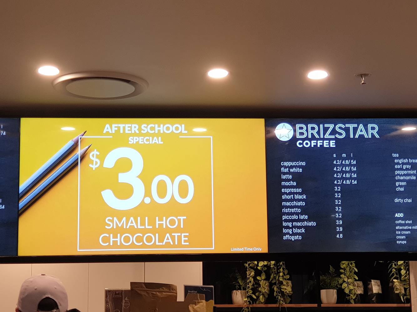
| Café or restaurant queue | Static menus plus selective animation/video | Food imagery and promotions can benefit from movement without reducing menu clarity |
| Reception or waiting area | Short video and sequenced content | Longer dwell time allows explanation and storytelling |
| School entrance facing traffic | Simple static messages and appropriately timed changes | Clarity and road-safety considerations should dominate |
| Indoor school or event display | Animation and video where appropriate | Longer attention windows support richer community content |
| Entertainment venue | Video, motion graphics and animation | Audiences expect atmosphere and have longer opportunities to watch |
The table is a starting point rather than a rigid formula.
The correct strategy should always consider the actual site.
That is why Blink Digital’s installation process includes site assessment and positioning, and why our consulting and design service is built around the intended brand, audience and environment.
Digital Signage for Retail: Make the Offer Understandable First
Retail signage has one major advantage: the audience is often already in a shopping mindset.
The screen’s job is to interrupt that journey just enough to create interest without making the offer difficult to process.
Static product photography is excellent for communicating one offer quickly.
Subtle animation can help a new price, product or promotion stand out.
Short video becomes useful when shoppers move slowly, browse nearby or queue within viewing distance.
Imagine a fashion retailer.
A roadside screen might show:
NEW SEASON
IN STORE NOW
A window display could show the same campaign with models subtly changing or product details appearing.
Inside the store, a longer-format screen might show the range being worn and styled.
These are not competing creative strategies.
They are three versions of the same campaign adapted to three different attention windows.
Blink Digital provides retail-focused LED signage as part of its wider digital-signage range and can help retailers design systems that work across different customer touchpoints.
Digital Signage for Car Dealerships: Sell the Decision, Not the Entire Vehicle
Automotive businesses often have excellent visual content.
There are vehicle videos, interior footage, technology demonstrations, model specifications, finance offers and promotional campaigns.
The temptation is to put all of it on the roadside sign.
That is usually too much.
For passing traffic, concentrate on the decision you want to influence:
NEW MODEL AVAILABLE
TEST DRIVE TODAY
USED VEHICLES THIS WAY
WEEKEND SALE
Inside the showroom, the content can become much deeper.
Full-motion video can demonstrate driving features, interiors, technology, colours or lifestyle positioning.
Blink Digital’s existing dealership guidance similarly emphasises clarity over clutter and matching messages to viewing conditions.
The most effective dealership signage system therefore may not choose between static content and video at all.
It may use both — in the correct locations.
Digital Signage for Schools: Information Comes Before Entertainment
School LED signs may serve students, parents, staff and the broader community.
The most useful content often includes event dates, reminders, achievements, notices, enrolment information and community messages.
At a roadside entrance, comprehension should come first.
A message such as:
OPEN DAY
SATURDAY 10 AM
needs very little animation.
The date is the information.
Animation should not make the date harder to read.
Inside a sports hall, auditorium or event environment, the situation changes. The audience has more time, and video or animated content may be appropriate for celebrating achievements, showing event highlights or recognising sponsors and community partners.
Blink Digital supplies LED signs for schools and also works with scoreboard and event-display applications, giving schools the opportunity to use different content approaches for different parts of the campus.
Digital Signage for Hospitality: Use Movement to Create Appetite, Not Confusion
Food and hospitality are naturally visual.
A slow-motion pour, steam rising from a dish, a product reveal or short lifestyle video can be highly appealing.
That makes hospitality an excellent environment for animation and video — provided practical information remains readable.
If a customer needs to read a menu, prices should not disappear every two seconds.
If a person is deciding whether to enter a roadside venue, an attractive food video is less useful if they cannot work out what the offer is.
Consider separating the roles.
Use one screen or content zone for practical information.
Use another for atmosphere and product imagery.
Or divide time intelligently, ensuring the key offer receives sufficient visibility.
The result is digital signage that attracts attention without forcing customers to chase information around the screen.
Digital Signage for Events: This Is Where Motion Can Shine
Entertainment and event environments are different from most roadside applications because audiences often expect movement.
People may be standing in front of stages, waiting in entrance areas, watching scoreboards or spending extended periods inside a venue.
Full-motion video, animated event branding, countdowns, live content, sponsor sequences and visual effects can all contribute to the experience.
Blink Digital provides LED solutions for entertainment venues and events, including displays suited to motion graphics and video.
Even here, however, information still needs hierarchy.
A spectacular animated background should not make the event time unreadable.
A sponsor video should not obscure emergency information.
A moving graphic should not compete with a critical directional message.
The purpose of the screen still comes first.
Test What Customers Actually Notice
The strongest digital-signage strategy is not based solely on opinion.
Test it.
Rather than asking staff members which design they prefer on a laptop, observe what customers actually do when the creative is displayed in its intended environment.
Try two versions of an offer.
Run a static version during one comparable period and a restrained animated version during another.
Compare enquiries.
Compare foot traffic.
Compare featured-product sales.
Use promotion codes where practical.
Ask customers how they heard about the offer.
Track QR scans where the viewing environment makes QR codes appropriate.
Compare different dayparts.
The same principle applies to message sequencing.
If customers respond more strongly to a single offer displayed for longer than a seven-slide playlist, that is valuable information.
If subtle movement improves engagement without reducing comprehension, keep it.
If a beautiful video produces plenty of attention but few enquiries, reconsider whether the commercial message is visible enough.
Digital signage gives businesses the flexibility to improve content without replacing the physical sign.
That flexibility becomes much more valuable when it is used to learn.
Common Digital Signage Content Mistakes
The recurring mistakes can be reduced to one underlying problem: designing for the screen instead of designing for the viewer.
Businesses see a bright LED display and try to use every capability at once.
Too much text.
Too many slides.
Too many animations.
Too many messages.
Transitions that are more noticeable than the offer itself.
Video that takes too long to reveal the product.
Calls to action that are unrealistic for the environment.
Tiny QR codes viewed from across a road.
Fine print that no passing customer could possibly read.
The solution is not necessarily to remove all movement.
It is to give every element a reason for being there.
A useful digital-signage content rule is:
First attract attention. Then make the message understandable. Then make the next action obvious.
If animation assists that process, use it.
If video assists it, use video.
If a static image communicates the message faster, use the static image.
The format is a tool.
The outcome is what matters.
How Blink Digital Can Help You Choose the Right Content Strategy
Choosing an LED screen is only part of creating successful digital signage.
The screen size, pixel pitch, brightness and installation position matter, but the content shown after installation determines how people experience the display every day.
Blink Digital’s services cover custom LED screens, digital signage installation, site assessment, positioning, consulting, design, maintenance and ongoing support. Our team works with businesses to match signage solutions to the intended audience and environment rather than treating every installation the same.
We can help you consider questions such as:
Will most people see the display while driving or walking?
How far away will they be?
How long will the screen remain in view?
Does the location suit static messages, restrained animation or richer video?
How many messages should be in the content cycle?
What information needs to remain visible for longer?
What should the primary call to action be?
How should content change between morning, afternoon and evening?
Does the planned installation need specific Council consideration or approval?
Those questions are often more important to marketing performance than deciding whether an animation looks impressive on a desktop computer.
Blink Digital can also help businesses think beyond the launch campaign. Because LED and digital signage can be updated over time, content can evolve according to promotions, seasons, events and customer response.
That turns the display from a one-off sign into an ongoing communication platform.
So, Is Static, Animation or Video Best for Digital Signage?
There is no single winner.
Static content is best when comprehension needs to happen immediately.
It is particularly useful for roadside communication, short viewing windows, business identification, pricing and clear promotional messages.
Subtle animation is best when you want to increase visual attention without sacrificing clarity.
It suits many retail windows, pedestrian areas, showrooms, forecourts and commercial environments where people have slightly more time to look.
Video is best when viewers have sufficient dwell time to follow a sequence.
It can be extremely effective in reception areas, waiting spaces, event venues, shopping environments, showrooms and other locations where storytelling adds value.
The mistake is assuming that the most visually complex format must be the most effective format.
Research suggests motion can increase attention to digital displays, but roadside research also shows that complexity, frequent transitions and animation can create additional demands on people who are already performing another task.
For marketers, that leads to a simple principle:
The best digital signage content is not the content that moves the most. It is the content that communicates the most effectively in the time the audience actually has.
At Blink Digital, that is how we encourage businesses to think about their LED signage: start with the site, understand the audience, determine the viewing opportunity, establish the message and then choose the creative format.
Technology gives you the options.
Strategy determines which option to use.
Make Your Digital Signage Work Harder with Blink Digital
If you are planning a new LED sign, upgrading an existing digital display or unsure whether your content should use static images, animation, video or a combination of all three, Blink Digital can help.
Our team can assist with the complete digital signage process, from selecting the right display and assessing your location through to design, installation, programming and ongoing support. Whether your audience is passing your business at road speed, walking past a shopfront, browsing a showroom or spending time inside a venue, we can help you build a signage solution around the way those customers actually see and understand your message.
Contact Blink Digital today for more information, practical advice or a customised quote for your digital signage project.
The goal is not simply to put more movement on a screen.
It is to make every second of attention count.